Scatter plots


Basics on the topic Scatter plots
Scatter Plots – Definition
In everyday life, we often see graphs that show how two things are related, like how much exercise people do and how much water they drink. In math, we use scatter plots to find patterns in this type of data. Scatter plots provide a simple yet powerful way to visualize and analyze the relationship between two variables. Whether in the classroom or real-world applications, they help us understand trends, make predictions, and identify unusual patterns. By plotting individual data points on a graph, scatter plots enable us to quickly discern whether a relationship between variables exists, and if so, what kind of relationship it is.
A scatter plot is a type of graph used in statistics to show the relationship between two different sets of data. On a scatter plot, each point represents a pair of values.

Scatter Plots – Variables
Scatter plots are essential tools in statistics and data analysis. They help us see if there is a relationship between two variables, also known as bivariate data, such as height and weight, or study time and test scores. In these plots, we often deal with two types of variables: independent and dependent.
| Variable Type | Description | Position in Scatter Plot | Example |
|---|---|---|---|
| Independent Variable | The variable that you change or control in an experiment. | Typically plotted on the x-axis. | Amount of time spent studying. |
| Dependent Variable | The variable that depends on the independent variable and what you measure in the experiment. | Usually plotted on the y-axis. | Test scores in a study about study time. |

Bivariate Data: This term refers to when you look at two variables together to see how they relate. For example, you might compare rainfall amounts with how well crops grow. Each point on a scatter plot shows one set of these two things, which helps us see if they might affect each other.
Understanding the roles of independent and dependent variables in scatter plots is essential for correctly interpreting the data. These plots are mainly used to examine the effect of the independent variable (like rainfall) on the dependent variable (like crop growth). This understanding is especially important in fields such as science, economics, and social research, where predicting trends and analyzing variable relationships is key.
How to Graph a Scatter Plot
Let's create a scatter plot comparing the number of hours of sleep a student got with the grade they received on their latest math test.

Step 1: Choose and Define Two Variables
For our scatter plot, we will compare:
- x-axis (Independent Variable): Number of hours of sleep
- y-axis (Dependent Variable): Test grade (out of 100)
Step 2: Draw and Label Axes Create a horizontal line (x-axis) and a vertical line (y-axis) on graph paper or in a graphing tool.
- Label the x-axis as "Hours of Sleep."
- Label the y-axis as "Test Grade (%)."
Step 3: Choose an Appropriate Interval
Before plotting the data, it's important to choose suitable intervals for the axes. This will help in accurately placing and reading the data points.
- For the x-axis (Hours of Sleep), consider the range of hours you want to include. For example, you might choose an interval of 1 hour and range from 0 to 12 hours.
- For the y-axis (Test Grade), choose an interval that makes sense for test scores. You might use an interval of 10% for grades ranging from 0 to 100%.
Choosing the right intervals will make your scatter plot more readable and your data easier to interpret.

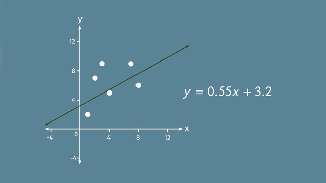
Step 4: Plot Points
The data in the table can be translated into coordinates (x,y).

Plot each coordinate on the graph where the x-value (hours of sleep) and y-value (test grade) intersect.

Constructing a Scatter Plot – Guided Practice
It’s your turn to create a scatter plot, you will need a piece of graph paper and a pencil to try it yourself.
You're curious if warmer weather leads to more ice cream sales. Using data from the past week, plot a scatter plot with temperature (in °F) on one axis and ice cream sales (in $) on the other to investigate this.


Scatter Plot Trends


Linear and Non-Linear Trends
Scatter plots not only show relationships between two variables but also reveal the nature of these relationships. There are two primary types of trends that scatter plots can illustrate: linear and non-linear.
Linear Trends
A linear trend in a scatter plot shows a straight-line relationship between the variables. This means as one variable increases or decreases, the other variable changes at a constant rate.
Real-World Example: A linear trend could be seen in a scatter plot comparing the speed of an internet connection to the time it takes to download a large file. Generally, as internet speed increases, the download time decreases consistently.
Non-Linear Trends
A non-linear trend indicates that the relationship between the variables changes at different rates. This trend is represented by a curved line on the scatter plot.
Real-World Example: An example of a non-linear trend could be the relationship between speed and fuel efficiency in cars. Initially, as speed increases, fuel efficiency improves, but after reaching an optimal speed, further speed increases might decrease efficiency.

Understanding these trends is crucial for interpreting scatter plots accurately. It allows us to make more nuanced predictions and understand complex relationships in data, which is especially important in fields like environmental science, economics, and engineering.
Scatter Plots – Real-World Application
Scatter plots are incredibly useful in various real-world situations, particularly for making predictions. A common application is in understanding consumer behavior based on environmental factors.
Consider a situation where a local business wants to estimate the number of beachgoers based on the day's temperature. They collect data over several weeks to analyze the trend and make predictions.
| Temperature (°F) | Beach Attendance |
|---|---|
| 70 | 120 |
| 75 | 200 |
| 80 | 180 |
| 85 | 210 |
| 90 | 190 |
| 95 | 220 |

Prediction: At 88°F, predicting beach attendance becomes more nuanced due to the non-linear trend. The business might expect attendance to be around 200, considering the fluctuations observed at similar temperatures.
Scatter plots and their line of best fit in these scenarios are valuable for their ability to reveal complex patterns and trends that are not immediately obvious, aiding in more accurate predictions and better decision-making.
Constructing Scatter Plots – Exercises
Grab some graph paper and try the following scatter plot problems on your own!


Scatter Plots – Summary
Key Learnings from this Text:
- Scatter plots display the relationship between bivariate data (two variables).
- They help identify patterns, associations, outliers, and clusters in data.
- Positive association shows an upward trend, negative association shows a downward trend, and no association indicates a random pattern.
- Scatter plots can show either linear trends, where data points form a straight line, or non-linear trends, where the data points create a curved pattern.
- Scatter plots are valuable tools in statistics and real-world data analysis.
Scatter Plots – Frequently Asked Questions
Transcript Scatter plots
Poor Billy Fakespeare the Ghost - his Medieval Party was a bust. Hardly any ghost guest showed. But, to celebrate his 400th birthday, he’s determined to have a big Luau themed shindig with lots and lots of guests. To plan the perfect party, he uses scatter plots.
Postive correlations
On a Cartesian plane, scatter plots are used to show the relation between variables to identify trends. Take a look at this scatter plot – it shows the relation of the popularity of a DJ to the number of guests attending a party. For example, a DJ with a 50 percent popularity rating had 200 guests in attendance and a DJ with a popularity rating of 80 percent had 350 guests. The graph indicates a trend: The more popular the DJ, the greater the attendance at the party. Notice the points on the graph are grouped together - this indicates a high correlation.
And since both variables increase together, the correlation is positive. When points are grouped together, you can draw a 'trend line' also known as the 'line of best fit'and by using any two points that lie on or near the line, you can calculate the slope of the line. And then use the slope and one of the known points to write an equation for the trend line. For this line, using slope equal to 5 and the ordered pair 50 and 200, we can figure out the equation of the line. You can also use the trend line to predict unknown values for 'x' and 'y'. For 'x' equal to 20, we can determine that 'y' is equal to 50 is a better prediction than 'y' is equal to 300.
Negative correlations
Fakespeare thinks he’s got the entertainment for the party all figured out. He invites DJ Mozart to rock the house, but he wonders, is music enough? What about games? He does some research. Take a look at the table. Is there a trend between the number of silly party games and party attendance? Let’s design a scatter plot. For the x-axis, list the number of games, and for the y-axis, list the attendance. Now, plot the order pairs. Hmmm, the points are grouped together, so the data is highly correlated, but as the number of games increases, the number of guests decreases and this indicates a negative correlation.
When there is a negative correlation, as one variable increases, the other decreases. You don’t need to be a genius to figure out that party games are a terrible idea, so Fakespeare decides, there will be no party games. What about refreshments? Will having tropical drink umbrellas make people want to come to the party? Let’s take a look at the scatter plot and see if there's a trend. The points on the graph are very spread out, so there is no correlation and no trend. Tropical drink umbrellas might not increase attendance, but they won’t have an adverse effect either, so Fakespeare orders a case just because he likes them. It seems as though Fakespeare has got everything under control, but do you? Let’s make sure you are good to go with scatter plots.
Correlation Interpretation
When the data is spread out with no pattern, that means there is little to no correlation and no trend. Althought this scatter plot shows the points grouped together, there is no trend. If the line of best fit is horizontal that means that what we measure on the x-axis has no influence on what we're measuring on the y-axis. What if the line of best fit is vertical? Since the slope of a vertical line is undefined, there is no correlation and no trend. One last note: If there is a correlation, don’t automatically jump to the conclusion that there is also a trend. You will need to use common sense because sometimes a correlation is not causation – meaning, one thing does not necessarily cause the other. Take a look at this example. Based on the trend line you might think the house number and party attendance are related, but that’s coincidence, not a trend. When interpreting trends, remember to use common sense. Fakespeare’s party is a huge success! Too bad though. none of the photos that were snapped lasted very long, maybe they're on to something?
Scatter plots exercise
-
Summarize your knowledge about scatter plots.
HintsWe examine if the value of $x$ has an impact on the value of $y$.
A line is given by the equation $y=mx+b$, where $m$ is the slope and $b$ is the $y$-intercept.
A line with a positive slope is increasing. This one has a negative slope and is decreasing.
SolutionOn a coordinate plane, scatter plots are used to show relationships between variables in order to recognize trends.
Take the first scatter plot as an example: It shows the impact of the popularity rating of a DJ to the number of guest attending a party. A DJ with a 50% popularity rating has 200 guests in attendance and one with 80% leads to 350 guests.
So we can assume a trend (correlation): The higher the DJ popularity rating the higher the number of guests.
The points on the graph are grouped closely together. This indicates a high correlation. In this case the correlation is positive.
So you can draw a trend line, also called the line of best fit.
For the line of best fit, you can calculate the slope as well as the $y$-intercept using two given points on the line.
-
Interpret the different scatter plots.
HintsIs there a line that fits the given data? If so, this line is given by the equation $y=mx+b$. Where $m$ is the slope.
An increasing line of best fit has a positive slope and thus a positive correlation.
If the data isn't grouped at all there is no correlation.
If the data doesn't change depending on $x$, that means a line of best fits parallel to the $x$-axis, there is no correlation.
SolutionLet's consider the diagrams from left to the right:
- When the date is spread out with no pattern we can conclude that there is no correlation and no trend.
- But even if data is grouped together we can't conclude a correlation. If the line of best fit is horizontal we have then measure on the $x$-axis has no influence on what we're measuring on the $y$-axis. Therefore, no correlation exists.
- If the line of best fit is a vertical line, the slope is undefined. Thus, we have no correlation and no trend.
- An increase in grouped data from left to right represents a positive correlation
- A decrease in grouped data from left to right represents a negative correlation.
-
Draw a scatter plot.
HintsPay attention to the labelling of the $x$- as well as $y$-axis.
If you want to draw the point $(220,190)$, draw a line parallel to the $x$-axis passing $y=190$, and one parallel to the $y$-axis passing $x=220$. The intersection of those lines is the wanted point.
The age is represented by $x$, while the number of friends is represented by $y$.
SolutionHere you can see the resulting scatter plot. To each age ($x$), there is a number of friends ($y$) given. So we can conclude, in total seven ordered pairs, which you can see in this diagram from left to the right:
- $(220,190)$
- $(230,170)$
- $(250,160)$
- $(280,140)$
- $(320,140)$
- $(350,130)$
- $(380,120)$
Let's have a look at $(280,140)$:
- Draw a line parallel to the $x$-axis passing $y=140$.
- Draw a line parallel to the $y$-axis passing $x=280$.
- The intersection of those lines is the wanted point.
-
Interpret the given scatter plot.
HintsAn increasing line of best fit stands for a positive correlation.
The $x$-axis represents the amount of effort needed, and the $y$-axis represents the amount of fun had.
SolutionLet's pick some pets:
With turtles, the effort they take isn't so much... however, the resulting amount of fun isn't too high either.
With cats and dogs, perhaps the most beloved pets, the effort for a cat is a little bit less than the effort for a dog. According to this diagram, the fun is also a little bit less for a cat than for a dog. But perhaps cat lovers wouldn't agree.
The pets which take the most effort are the horses, and they are also the animal which are the most fun.
We can conclude that the data seems to be grouped, and that the line of best fit is increasing. So we have a positive correlation. So, the higher the effort the higher the fun and vice versa.
-
Determine the slope-intercept form of the line of best fit.
HintsUse this formula to find the slope.
Use the slope-intercept form of a line ($y=mx+b$) to find the $b$ term by plugging in either point as $x$ and $y$.
"DJ with a 50% popularity rating has 200 guests in attendance" can be represented by the ordered pair $(50, 200)$.
"DJ with 80% popularity leads to 350 guests" can be represented with the ordered pair $(80, 350)$.
$(50, 200)$ this point gives us $x_1 = 50$ and $y_1 = 200$.
$(80, 350)$ this point gives us $x_2 = 80$ and $y_2 = 350$.
SolutionAny linear equation can be expressed in slope intercept form as $y=mx+b$.
- We first determine the slope $m$ by the formula:
- $m=\frac{y_2-y_1}{x_2-x_1}$.
- So we need two points. Those are given by the information of the impact of 50% (80%) popularity rating on the number of guests 200 (350).
- So we have two points $(50,200)$ and $(80,350)$. Now we put the coordinates of those points in the formula above to get
- $m=\frac{350-200}{80-50}=\frac{150}{30}=5$.
- $200=5(50)+b$.
- Subtracting $250$ results in the y-intercept $b=200-250=-50$.
-
Explain what kind of data you can represent in a scatter plot.
HintsHere you see an example of a bar graph.
An ordinal data set is one where each data point is assigned a numerical quantity, which establishes an ordering on the entire set of data.
A nominal data set is one where each data point is assigned to a distinct category, which does not provide a measurement or order on the set of data.
The bar graph represents a nominal data set.
Let's have a look at an example: if three people lived in house number $1$, four people lived in house number $2$, five people lived in house number $3$, and so on, then we couldn't conclude that the house number tells us anything about the number of people living in that house.
SolutionScatter plots are used to show relations between variables to recognize trends. The data use must be ordinal in order to make a scatter plot, as there must be a way to order the points so that they can be compared.
You can use scatter plots to try to find correlations. However, a positive (or negative) correlation doesn't have to imply a trend. For example, if three people lived in house number $1$, four people lived in house number $2$, five people lived in house number $3$, and so on, then we couldn't conclude that the house number tells us anything about the number of people living in that house.
For ordinal data, bar or line graphs can also be used as well.
Nominal data cannot be represented with a scatter plot, so bar graphs are usually used instead.