Circle Graphs


Basics on the topic Circle Graphs
A circle graph, or pie chart, is a graph that is made by dividing a circle into sections. It is used to compare proportions or show information as to how the parts relate to the whole by representing these parts as percentages or fractions. It’s a way of representing data that shows the fractional part or percentage of a whole as an appropriately-sized wedge or section of a circle.
To create a circle graph, check first if the data set makes a whole. If so, convert your data to percentages or fractions and compute for the corresponding central angle that determines the size of each section by multiplying the fraction by 360°. Create the graph and finally give your graph a title and don’t forget to label the sections.
Circle graphs display information in a format that is easy for people to understand. It is often used in newspapers and daily periodicals. It’s a popular tool in politics because it is an excellent way of displaying what percentage of the population supports a particular candidate. Circle graphs can also illustrate what portion of the population is in favor of a particular idea. It has valuable applications in history, social studies, and science.
Summarize and describe distributions.
CCSS.MATH.CONTENT.6.SP.B.5
Transcript Circle Graphs
Every year, the Griswald family goes on vacation to get away from their city with its blinding lights. Usually, the Griswalds go to a campground in California known for their Joshua trees - and it’s where Mom and Dad Griswald first met and fell in love. Mom thinks it’s romantic, but the kids? Not so much. Since it's such a beautiful day, the Griswald family decides to go try a different place in southern California, but they just can’t agree on where to go, what to do OR how to get there.To decide, Grandma Griswald suggests they spin a vacation wheel, and Dad Griswald says to make it fair, the family should use a circle graph, also known as a pie graph.
Setting up a table
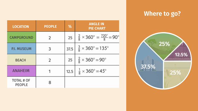
How should the Griswalds do this? Grandma Griswald makes a table and lists the vacation destination choice for each of the 8 family members. Each person can only vote for one destination. 2 out of 8 want to go to the camp ground with the Joshua trees - again, 3 out of 8 Griswalds want to go to the P.I. Museum. 2 want to go to the beach to see every breaking wave and 1 desires to go to Anaheim. There is also a column listing the percentages: 37.5% want to go to the P.I. Museum, 25% want to go camping, 25% want to go to the beach and 12.5% want to go to Anaheim.
Drawing a graph
To draw the graph, we need to divide the circle into sectors to represent the various choices. Remember, a sector looks like a slice of pie. Let’s calculate the central angle of each sector. We'll use the fraction of the number of people and their corresponding choice to figure out the central angle for each sector: 2 out of 8 want to go camping, so multiply two-eighths times the angle measure of a full circle, 360°. The sector will have a central angle of 90°. Okay, now we'll do this for each sector, and then we can use the angle measurements to set up the graph. An advantage of circle graphs is that they also identify the percentage of each sector. This graph is looking good and Dad is ready to spin. The Griswalds are going to Anaheim!
Next choice, when to go. Take a look at the table. The grandparents are retired, so they don’t care when the vacation happens, they just want to spend time with the family. So only 6 family members will vote this time. Let’s see, 3 want to go during Summer 2 want to go in Spring and 1 wants to go during final exam week.
Now, let's figure out the central angles. You could also use the percent to calculate the central angle for each sector, but because of rounding errors, the fraction method may be the most accurate. Okay! Let’s calculate! Set up the graph, label each sector, adjust the central angle. and spin. This is going to be an interesting vacation. The Griswalds are going sightseeing in southern California this summer!
One last choice. How to actually get to southern California: 3 want to fly, 2 want to drive, 2 want to ride skateboards, and 1 wants to be teleported. Dad throws out the teleportation choice for obvious reasons. So we’ll calculate the angles as parts of seven. Dad is ready for the final spin and the Griswald family will take skateboards to southern California. Skateboards, hmm. I hope Grandma and Grandpa Griswald don't get vertigo. Off they go on their summer vacation on skateboards. Whoa! Look at Granny Griswald grind! I guess that answers our question about who else voted for skateboards!
Circle Graphs exercise
-
Explain how to draw a circle graph.
HintsEach partition of a circle graph looks like a slice of pie.
$100\%$ corresponds to the whole circle, with a corresponding central angle of $360^\circ$.
$\frac12$ corresponds to $50\%$, which corresponds to $180^\circ$.
SolutionOn the right-hand side you see the resulting circle graph, also known as a pie graph.
Here are the steps needed to get to this graph:
- Determine the percentage of each location. For example, $2$ people out of a total of $8$ people want to go to a campground. That's $\frac28\times 100\%=25\%$.
- Calculate the central angle of the corresponding sector for each location. So for the campground, that would be $\frac28\times 360^\circ=\frac{720^\circ}{8}=90^\circ$.
- Divide the circle into sectors, each sector with the correct central angle corresponding to a location.
-
Label the circle graph.
HintsThe central angle as well as the sector of the circle for the car and skateboard are the same.
The percentage of people who want a particular mode of transportation is the ratio of the number of people who want that particular mode of transportation and the total number of people.
Multiply this relation with $360^\circ$ to get the central angle.
SolutionLet's practice the construction of a circle graph step by step.
What do we already know? $3$ people decide to go by plane, $2$ by car and $2$ by skateboard. Together we have $7$ people.
First, we determine the regarding percental part as follows:
- Plane: $\frac37\approx 0.4286=42.68\%$ To get the percent we multiply with $100$.
- Car: $\frac27\approx 0.2857=28.57\%$
- Skateboard: $\frac27\approx 0.2857=28.57\%$
- Plane: $\frac37\cdot 360\approx154.28^\circ$
- Car: $\frac27\cdot 360\approx102.86^\circ$
- Skateboard: $\frac27\cdot 360\approx102.86^\circ$
-
Determine the angles for the circle graph.
HintsIf you sum all angles you get $360^\circ$.
To get each angle multiply the relation between the number of persons deciding for the regarding meal and the total number with $360^\circ$.
The total # of all people is the sum of the different numbers.
SolutionHere you see the circle graph to the meal problem. How do we get it?
We know that $3$ people decide for barbeque, $2$ for turkey and $5$ for pizza. So we have $10$ people in total.
Now we can consider that $360^\circ$ corresponds to the total number, and thus, the regarding sectors correspond to the relation between the number and the total number. In other words, we have to multiply each such relation with $360^\circ$ to get the central angle of the corresponding sector:
- Barbeque: $\frac{3}{10}\times 360^\circ=108^\circ$
- Turkey: $\frac{2}{10}\times 360^\circ=72^\circ$
- Pizza: $\frac{5}{10}\times 360^\circ=180^\circ$ This sector is easy to recognize: it's the half of the whole circle.
-
Interpret the circle graph.
HintsJust look at the percental part. This corresponds with the number of friends prefering the regarding sport.
For example, if the total number is $20$, $25~\%$ stands for $5$ people.
The size of the sectors corresponds with the percental part of the regarding prefered sport.
SolutionLet's turn the scope.
Here you see a circle graph showing the results of Paul investigation.
His friends, we can't get the total number from the graph, prefer the following sports
- Baseball $37.5\%$
- Basketball $37.5\%$
- Soccer $25\%$
Using this graph we see that as many people prefer baseball as basketball. The regarding sectors have the same size. The smallest sector is this one representing soccer. So least of Paul's friends prefer soccer.
-
Find the right circle graph.
HintsPay attention to the number of sectors. There are four different destinations.
Keep the relations in mind; the sector corresponding to the highest percent number must be the biggest one.
Because $12.5\%<37.5\%$, you must have the same order for the corresponding sectors.
SolutionOn the right side of the picture beside you see the resulting circle graph, also known as pie graph.
How can you decide which one matches with the given problem?
- Check the number of sectors. Because there are $4$ destinations there must be also $4$ sectors.
- You can see the percent numbers. Those have to correspond to the sectors. $25\%$ stands for a quarter circle. The sector to $37.5\%$ must be bigger and this one to $12.5\%$ smaller.
-
Decide which circle graph corresponds to each table.
HintsRemember, the sum of the percent is always $100$.
Determine for each given table the percentage corresponding to the given sport.
For this, first sum all given numbers to find the total number.
Next, divide the given number by the total number and multiply it by $100$ to give you the percentage.
Let's have a look at an example:
- Let the total number be $20$.
- The number at any position is $5$.
Two circle graphs don't have a match.
SolutionTo match each table with the corresponding circle graph, we have to determine the percentages of each sport. Then we can compare the circle graphs.
We match the circle graphs to the tables from left to right.
For the first table, we get the total number $20+20+40=80$ and thus the following percentages:
- Ice hockey: $\frac{20}{80}\times100\%=25\%$
- Soccer: $\frac{40}{80}\times100\%=50\%$
- Baseball: $\frac{20}{80}\times100\%=25\%$
Now we look at the second table. The total number is $9+5+6=20$ and thus we get the following percentages:
- Ice hockey: $\frac{9}{20}\times100\%=45\%$
- Soccer: $\frac{5}{20}\times100\%=25\%$
- Baseball: $\frac{6}{20}\times100\%=30\%$
The next table: The total number is $25+10+15=50$ and thus we can conclude the following percentages:
- Ice hockey: $\frac{25}{50}\times100\%=50\%$
- Soccer: $\frac{10}{50}\times100\%=20\%$
- Baseball: $\frac{15}{50}\times100\%=30\%$
So there is still one table left: First, we sum the numbers to get the total number $5+8+7=20$ and calculate the percentages next:
- Ice hockey: $\frac{5}{20}\times100\%=25\%$
- Soccer: $\frac{8}{20}\times100\%=40\%$
- Baseball: $\frac{7}{20}\times100\%=35\%$


LOL go granny!