Frequency Tables


Basics on the topic Frequency Tables
A frequency table is one way of summarizing data by keeping track of the frequency of occurrence of data values in a given data set.
To make a frequency table, start by arranging data values in increasing order. Create a table with three columns for the data values, tallied results, and frequency results.
List data values either individually or by intervals in the first column. Calculate the size of each interval by subtracting the smallest value from the biggest value and dividing the result by the number of desired intervals. An interval’s size must not be too big or too small and the number of intervals must not be too many or not enough. The typical number of intervals may range from 5 to 10.
To fill out the second column, inspect the sorted data set and tally the occurrence of the individual data value or interval. Finally, put together tallies for each interval, get the total, and record the frequency in the third column of the frequency table.
Summarize and describe distributions.
CCSS.MATH.CONTENT.6.SP.B.4
Transcript Frequency Tables
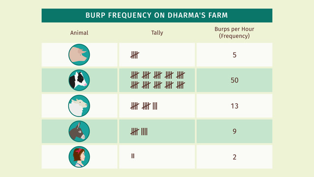
Dharma thinks the city has too much smog. So she moves to a farm far, far away from the toxic city air. What a great place! The air's so fresh! Holy cow! Something stinks! Pee-ew! That heifer is burpin' to beat the band. Dharma learns that farm animals, such as this belching babe, are responsible for 30% of methane emissions. Dharma counts the number of burps per hour for each of the animals living on her farm. And to keep track of the noxious belches she creates a frequency table.
Frequency Table
In the first column, she lists the animals and in the second column, she writes a tally mark for each burp. Since Dharma also burped twice just while making the table, she decides to include herself.
The last column in the chart is the frequency, which represents the total number of burps per hour for each animal. Some frequency tables omit tally marks, but since Dharma uses the chart to track the burps, the tally marks are helpful to ensure an accurate count. It's important to title the chart and include headings for each column.
This table makes it easy to see that the cow has the greatest number of burps in an hour and therefore emits the most methane gas. Frequency tables are often used to create bar graphs or dot plots. A bar graph is a graph that shows the distribution of data using bars to indicate frequency. This bar graph represents the same data as the frequency table, just in another format. Dot plots also represent the same type of data, but the results are not as easy to interpret because each dot could represent multiple burps, so a partial dot is sometimes used. When deciding which chart, table or graph to display, select the one that best conveys the data you wish to represent.
The cow is clearly the burping champion, and Dharma is not a-moo-sed at all. Her cud-chewing cow is an ecological disaster! But what can she do?
Eureka! Let's see what solution Dharma came up with, this gives new meaning to "running on fumes".
Frequency Tables exercise
-
Name the different ways to represent data.
HintsThe graph of a quadratic function is a parabola.
Here you see an example of a representation.
Some representations improve the readability of data. So the data can be interpreted much easier.
SolutionHere you see one kind of representation of the number of times each animals burps: the frequency table.
- The left-most column contains the names or pictures of the animals, and also of Dharma.
- In the middle column we tally the frequencies.
- In the right-most column the corresponding numbers are written down.
- The bar graph: the $y$-axis is labeled by frequency, while the $x$-axis is labeled by the different animals. The frequencies are shown as bars.
- The dot plot: it looks a little bit like a bar graph. What's the difference? The frequencies are shown as dots. Sometimes it's a little bit harder to read, like if one dot represents two burps, for example.
-
Find the right bar graph.
HintsPay attention to the $y$-axis; this is where the frequencies are labeled.
Compare the frequencies you get from the bar graph with those given in the frequency table.
The number of cow burps is the greatest of all the animals.
SolutionA bar graph is a graph that shows the distribution of data using bars to indicate frequency.
The graph corresponding to the frequency table above can be seen to the right.
The $y$-axis is labeled by the frequency. So you can determine the frequency belonging to each bar.
The $x$-axis is labeled by pictures of the animals as well as Dharma.
-
Find the right number of dots for the dot plot.
HintsThe number of dots for each pig corresponds to the number of apples that pig eats a day.
Highlight the dots from bottom to top.
Highlight two dots if the corresponding pig has eaten two apples.
SolutionDot plots represent data in a coordinate system:
- The $y$-axis is labeled by frequencies.
- The $x$-axis is labeled by names or numbers or pictures. Here it is labeled by the pig names.
The resulting dot plot can be seen beside.
-
Pair the right frequency tables with the right bar graphs.
HintsCheck the length of the bars for each item.
You can determine the length of any bar by drawing a horizontal line, parallel to the $x$-axis. The length can be read by the intersection of this line with the $y$-axis.
The length of each bar corresponds with the frequency of the corresponding item.
SolutionA bar graph is a graph that shows the distribution of data using bars to indicate frequency.
The $y$-axis and $x$-axis of each bar graph are labeled as follows:
- The $y$-axis is labeled by the frequency from $1$ to $12$.
- The $x$-axis is labeled by the letters $A$, $B$, $C$, and $D$.
So we can match as follows, from the left to right:
- The red bar graph.
- The green bar graph.
- The grey bar graph.
- The blue bar graph.
-
Determine the right frequencies.
HintsTo count the tally marks easier, note that five tally marks are marked as pictured here:
First, count the groups of five lines and then the remaining tally marks.
Here you see $5\times 5+3=28$ lines.
SolutionFrequency tables are used to show frequencies:
- In the first column the animals are listed.
- In the second column one can write down tally marks for each burp.
- The last column contains the number of burps. For this we have to count the corresponding tally marks.
- First, count all groups of five tally marks.
- Next, count the remaining tally marks.
- The total number is given by adding the number of tally marks altogether.
- There are two groups of five tally marks, giving us $5\cdot 2=10$ tally marks.
- There are three remaining tally marks.
- Together we have $2\times 5+3=13$ tally marks total.
-
Describe the given dot plot.
HintsThink about the frequency of families together with their corresponding number of children.
Pay attention to the labeling of the axes.
SolutionThis dot plot shows the frequency of families with one up to five children:
- There are $3$ families with one child.
- $8$ families have two children.
- Most families, namely $12$, have three children.
- Only $2$ families have four children.
- $3$ families have five children.
$3\times 1+8\times 2+12\times 3+2\times 4+3\times 5=78$
and the total number of families is
$3+8+12+2+3=28$.