Line and Bar Graphs


Basics on the topic Line and Bar Graphs
Both line and bar graphs can be used when presenting a set of data collected over a period of time. Bar graphs are plotted by drawing solid bars up to the quantity equivalent for each interval. It is very easy to recognize the high and low points of the data set when represented by a bar graph. Line graphs consist of points that represent the quantity for each interval, connected by a series of lines from one point to the next. The trending, whether increasing or descending, can be easily highlighted when the data set is represented by a line graph. Learn more about line and bar graphs by helping Frank the Insurance Guy relax on his vacation. Common Core Reference: CCSS.MATH.CONTENT.6.SP.B.4
Transcript Line and Bar Graphs
To check his stress level, Frank the Insurance Guy is at his weekly doctor's appointment. The doctor's prognosis isn't good. The doctor says that Frank has TMS Syndrome; TMS - Too Much Stress, to be exact; and prescribes a vacation, STAT! Frank seems skeptical. To illustrate the urgency of the situation, the doctor shows Frank data documenting his stress level in the form of a few charts. With the help of line and bar graphs, surely Frank the Insurance Guy'll better understand his situation.
So, on his doctors’ orders, Frank hops on a plane for the Bahamas. While on the boat heading to his vacation island, he sees the beautiful beach, the clear blue water and pigs swimming in the water. Pigs swimming in the water?! How cool! At the beach, Frank begins to fidget. He actually doesn't know how to relax! He has to do something, so he decides to keep a daily record of the number of pigs he sees swimming in the water during his vacation. Each day, at the same time, Frank counts the number of pigs in the water and records the data in a table.
Bar graphs
Let's take a look at the table. It shows the data for one week. To make the information easier to understand, Frank first draws a bar graph. Notice the days of the week are graphed on the x-axis, and the number of swimming pigs on the y-axis. The data points are illustrated with one bar for each day. See how the highs and lows are easy to pick out? Bar graphs are useful to show data that changes over time. But what if you wanted to plot more than one week's worth of data? What about three or four weeks' worth?
Line graphs
For tables with many data points, Bar graphs might not be the best way to go. Line graphs give you the same information as a bar graph. Each bar is replaced with a point. The resulting points can then be connected, making trends in the data easier to visualize.
Because Frank can’t handle so much down time, and because counting the pigs in the water isn’t a day-filling task, Frank also monitors his relaxation level every day of his vacation. After one week, the data table looks like this. Notice, he used mood icons to describe his relaxation level, rather than numbers. For a better overview, he draws a line graph. On the x-axis is the number of days, and on the y-axis, the mood icons, and then he draws in a line to connect the data points. Holy oink! The two graphs look almost the same!
Is there a relation between the number of pigs in the water and Frank’s relaxation level? Although we told him that just because the graphs look the same, there is not necessarily a relation - that would be ridiculous, but Frank isn't convinced. He lives for statistics, so he really believes the pigs are helping him relax. Frank has a crazy idea. Maybe Frank can relax when pigs fly?
Line and Bar Graphs exercise
-
Explain how to draw a bar graph.
HintsUsing a bar graph, you can see the relation between different data points much easier.
Pay attention to the labelling of the axis: you observe the swimming pigs each day, not the day for each swimming pig.
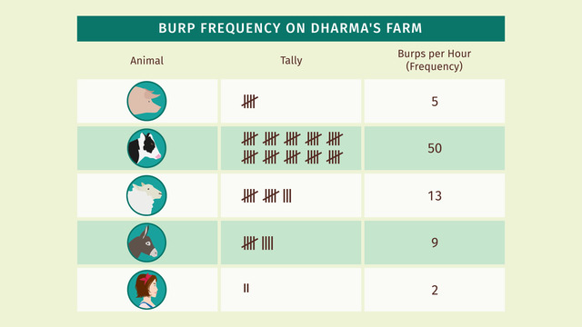
Here you see an example of a bar graph. It represents the number of burps of the different animals, including one human.
SolutionHere you see the given data on the left and the bar graph on the right.
How can Frank draw such a bar graph?
First, he needs to draw a coordinate plane. In this example the $x$-axis, or horizontal axis, is labeled by the day, and the $y$-axis, or vertical axis, is labeled by the number of swimming pigs.
For each day, Frank draws a rectangle as high as the number of swimming pigs observed.
-
Draw a line graph.
HintsThe day $3$ and day $4$ moods are the same.
Highlight each line connecting nearby points.
SolutionHere you see the resulting line graph.
First, we draw all the points corresponding to the data. From left to the right:
- on day $1$, mood level $2$,
- on day $2$, mood level $5$,
- etc.
-
Find the right data set for the bar graph.
HintsCheck each given data point.
Let's recall how to draw a point in a coordinate system:
- Draw a line parallel to the $y$-axis representing the day.
- Draw a line parallel to the $x$-axis representing the number of carrots.
- A point is given as the intersection of those two lines.
For example, one data point is given by $(2,1)$, meaning that the pigs only ate one carrot on the second day.
SolutionLet's check all the given points:
- The first day the pigs ate $3$ carrots.
- The second day they ate just one.
- On the third day they seem to be a little bit more hungry... they ate $5$ carrots.
- The next day they ate $3$ carrots again.
- From the fifth day one, they ate one carrot more than the day before: $4$ carrots on the fifth, $5$ carrots on the sixth, and $6$ carrots on the seventh day.
$\begin{array}{c|c|c|c|c|c|c|c} \text{day}&1&2&3&4&5&6&7\\ \hline \text{# of carrots}&3&1&5&3&4&5&6 \end{array}$
-
Decide which graphs represent the data given.
HintsIf you replace each bar with a point and connect the resulting points, you get a line graph.
There is one correct bar graph and one correct line graph for the given data.
The $x$-axis is labelled with the first letter of the first names of Dorothy's friends, while the $y$-axis is labelled with the number of siblings.
SolutionHere you see both the bar as well as the line graph.
- "Anne has $2$ siblings" is represented by the left-most bar.
- "Bella just has $1$ sibling" is represented by the lowest bar, the second one from the left.
- "Clara has $2$ siblings too" is represented by the third bar from the left.
- The bar most right represents "Doris has $3$ siblings".
-
Explain what line graphs and bar graphs are.
HintsWith line graphs one can recognize a trend much easier.
Here you see an example of a line graph.
This is the bar graph corresponding to the line graph above.
SolutionFor both, bar graphs as well as line graphs, we draw a coordinate plane:
- The $x$-axis is labeled with the days.
- The $y$-axis is labeled with the number of observed pigs.
Line graphs also give the same information. Each bar is replaced with a point and the resulting points can be connected.
As the number of data points grows greater and greater, bar graphs do not represent the data as well as line graphs.
-
Interpret the different graphs.
HintsTo get the number corresponding to a name, just draw a line parallel to the $x$-axis passing through the corresponding point.
The $y$-axis is always labelled with numbers.
If the line graph contains a line parallel to the $x$-axis, then the numbers corresponding to the endpoints of the line are the same.
SolutionThe number of breakfasts per week:
- Anne eats breakfast only $1$ time.
- Belle eats breakfast $5$ times.
- Clare eats breakfast $4$ times.
- Doris also eats breakfast $4$ times.
- Anne has $2$ mobile phones.
- Belle and Clara just have $1$ mobile phone.
- Doris has $3$ mobile phones at her disposal.
- Anne has the least number of sneakers, namely $3$.
- Bella has $4$ sneakers.
- The other two Clara and Doris both have $5$ sneakers.
- Anne and Bella seem to be the least sporty of Dorothy's friends; they can only do $1$ pull up.
- Clara and Doris are able to do $3$ pull ups each.